
McBains
Rebranding / Built Environment
“I was sceptical. I thought we’d get some off-the-shelf branding solution. But DC&CO dug deep into what truly makes us different. Our new identity underpins our confidence and a deeper sense of collective pride that, yes, we are special. The new branding really sets us apart and matches our bold ambitions for the future of the business.
Michael Thirkettle
CEO, McBains
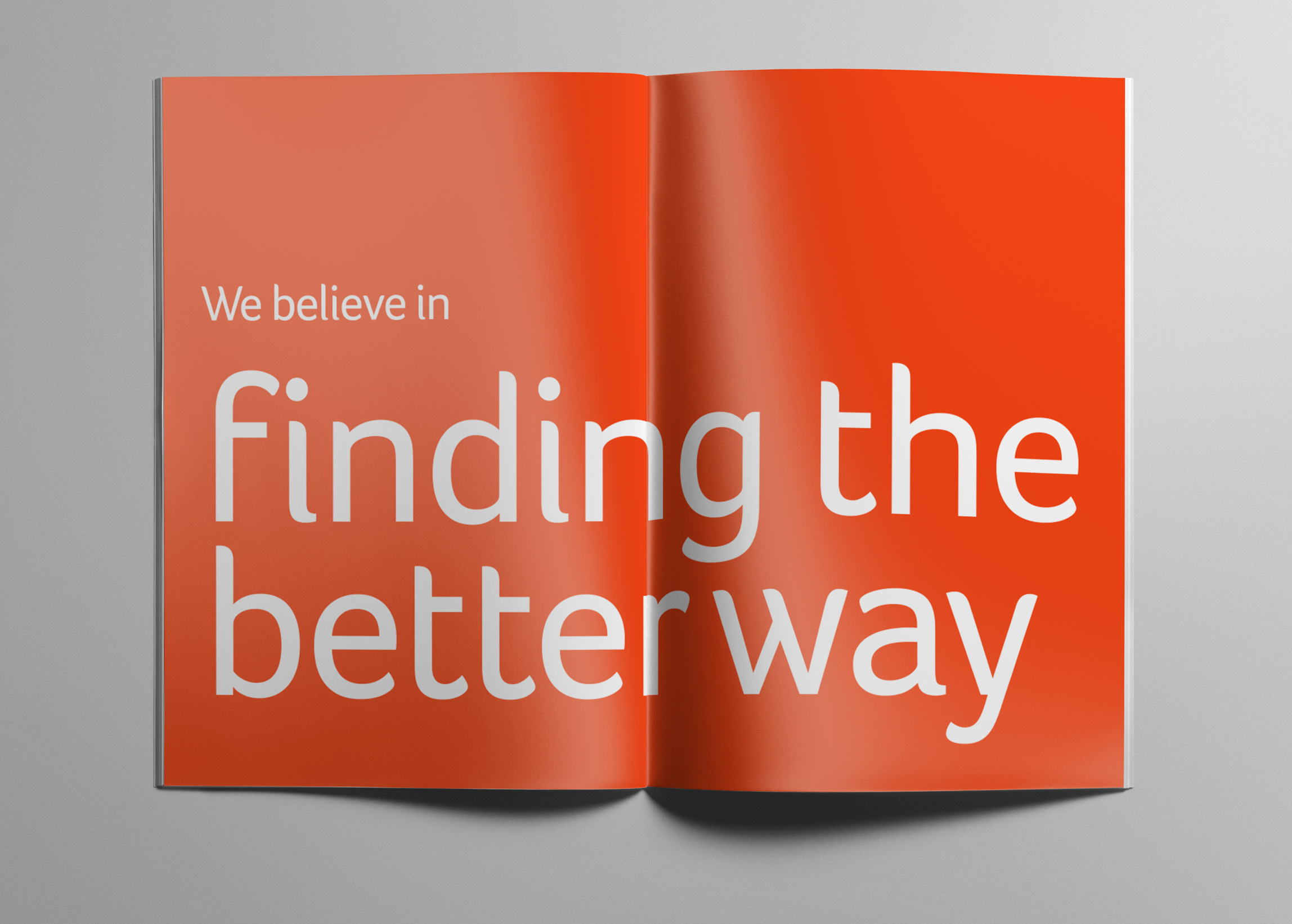
Well, we don’t do off-the-shelf. We started off by looking at McBains’ marketing material and competitors. Most importantly, we asked big questions of their team and clients about what was true and different about McBains. It’s an approach that’s paid dividends with many other clients.
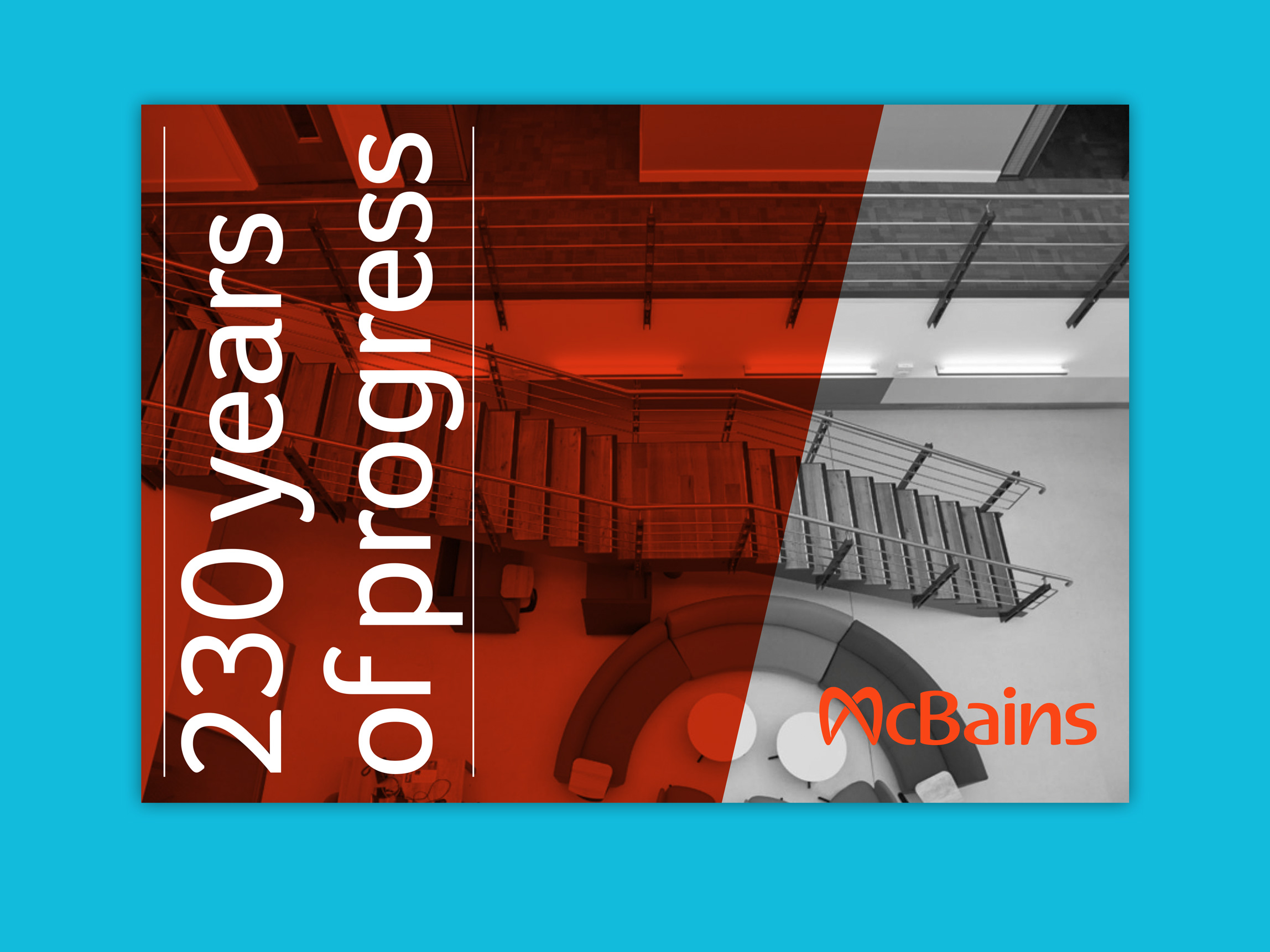
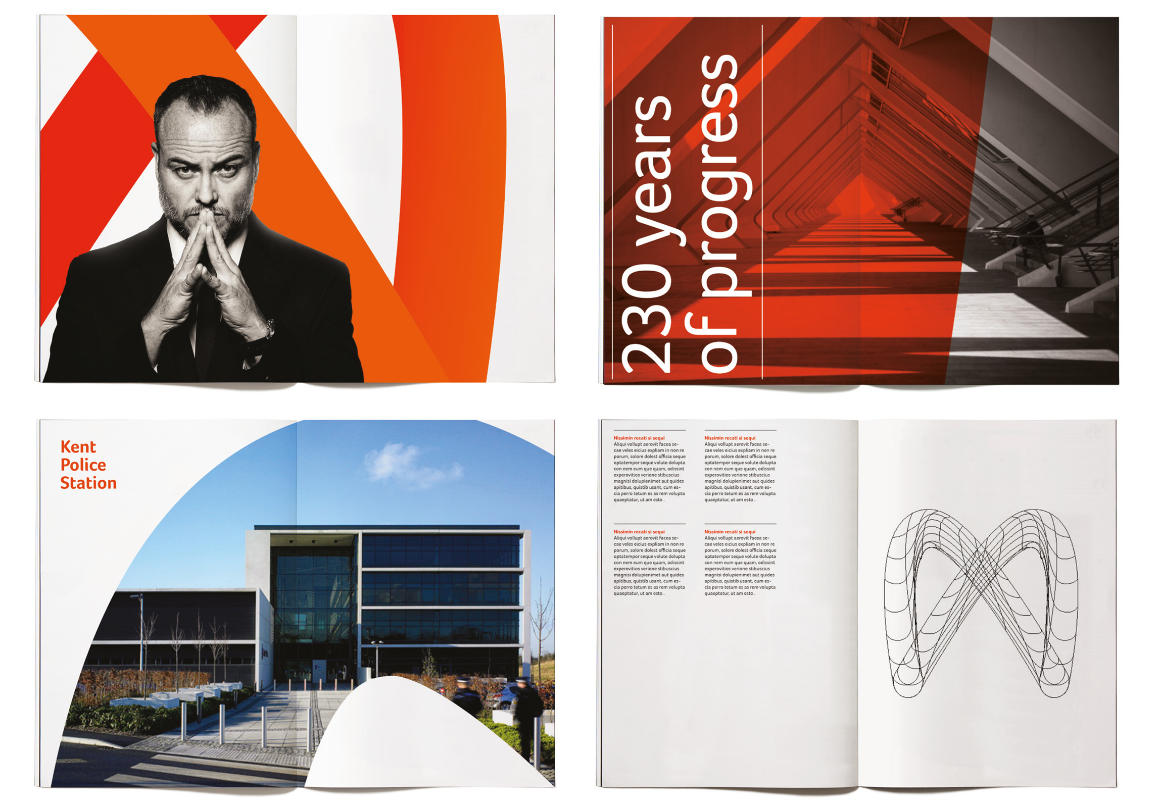
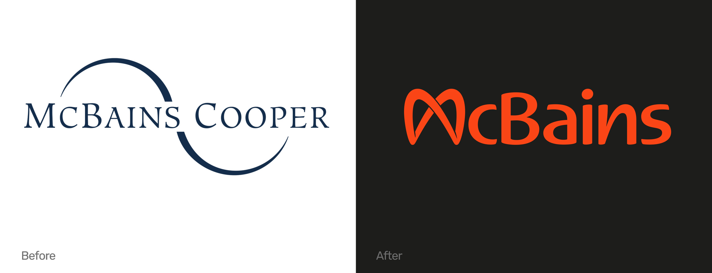
We distilled it into a compelling story: The McBains Code is a set of guiding principles which links their past, present and future. The board said ‘yes’, and it became the basis of the rest of the brand.
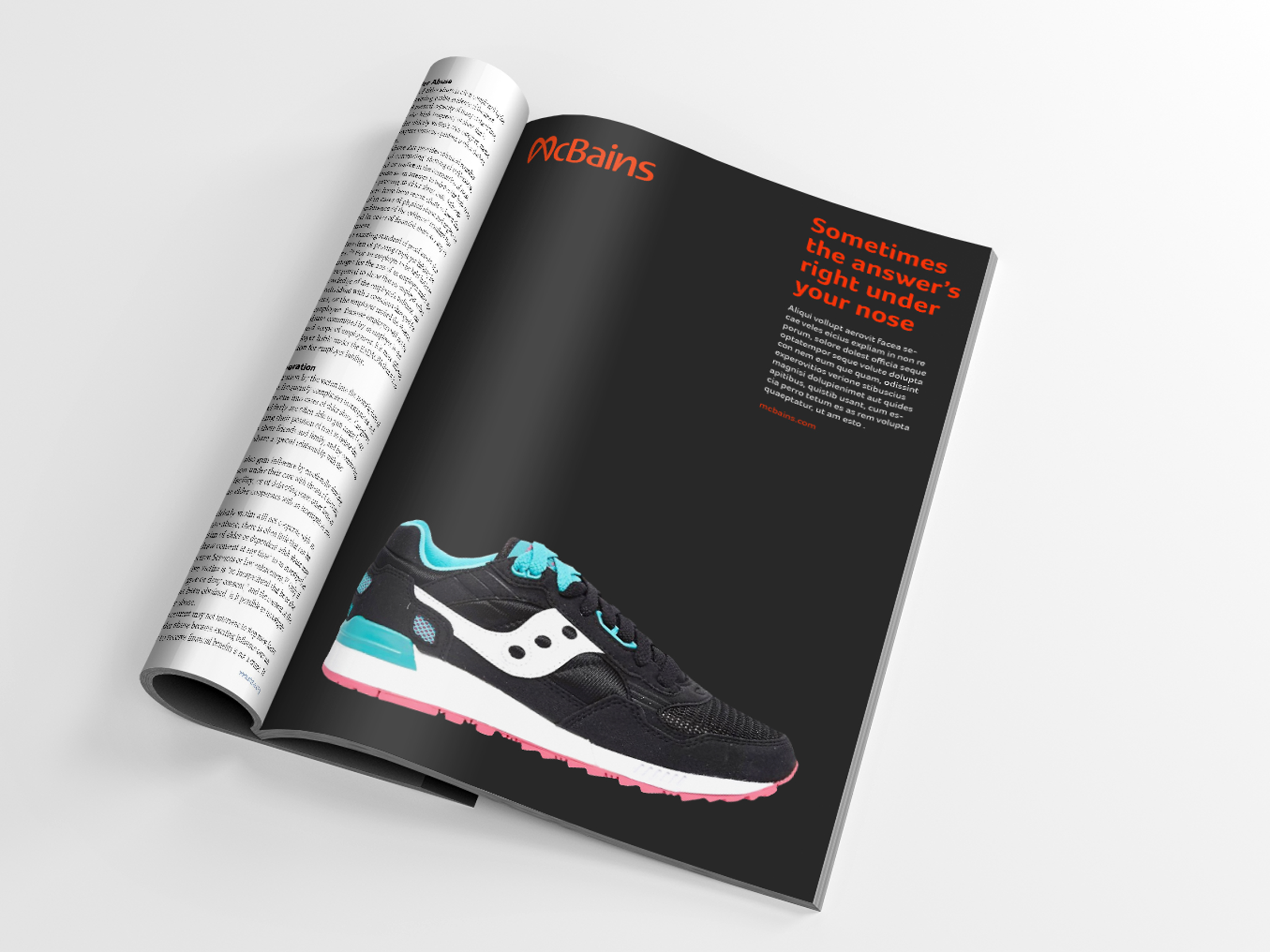
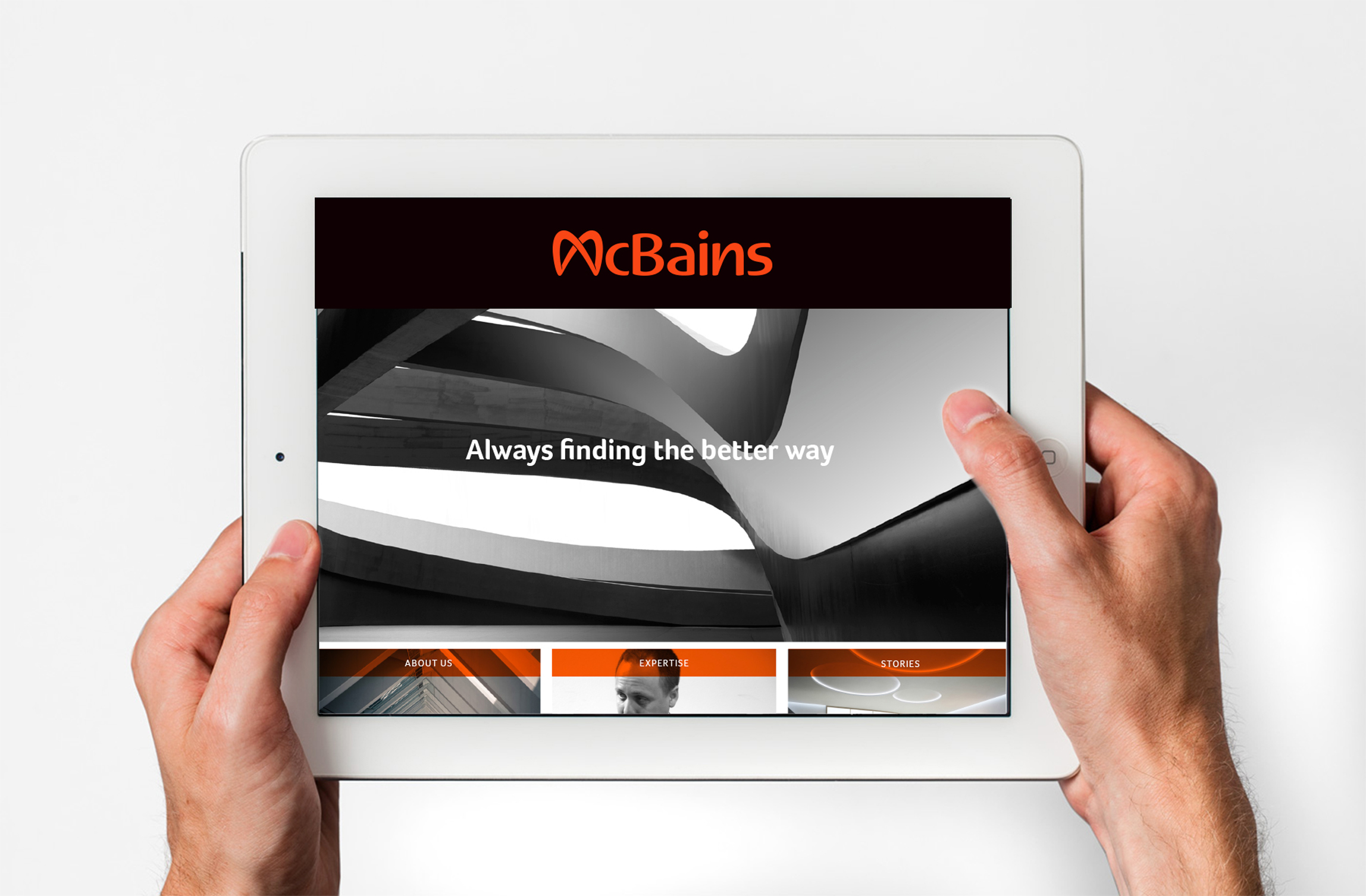
We looked at how the brand looks, how it speaks (tone of voice), how people behave, and how we want them to feel about the business. We presented three routes, and – as is often the case when your analysis is right – McBains went for the most revolutionary.
We crafted every element, and then presented the new brand to the staff conference, where a resounding show of hands endorsed the new approach. And in the process recommended shortening their name from McBains Cooper to simply, McBains.
Turnover up 81% within 5 years from £15.5m to £28m
![]()
![]()
What we did Rebranding, brand audit, client perception study, employee research, brand strategy development, brand positioning, brand naming, logo, brand identity, bespoke typeface, typography, photography, tone of voice, animations, brand book design, brand guidelines
How's your brand?
Feel free to get in touch for an initial conversation about creating the fresh start for your brand.