
Hunters
Rebranding / Website Law Firm
Lincoln's Inn. 300+ years. Future focus.
“This is about having a renewed confidence in who we are as Hunters. The rebrand and website is a solid investment in our business.
Henry Hood
Senior Partner
Hunters is a law firm founded in 1715. And for over 300 years they’ve been based in Lincoln’s Inn, the heart of legal London.
Our brief was simple: make Hunters modern and relevant to a new generation of high net worth individuals whilst retaining the stature that come with being a 300 year old law firm.
We started with defining their core story: who they are, why they’re different and why people would want Hunters to represent them or why people would want to work there.
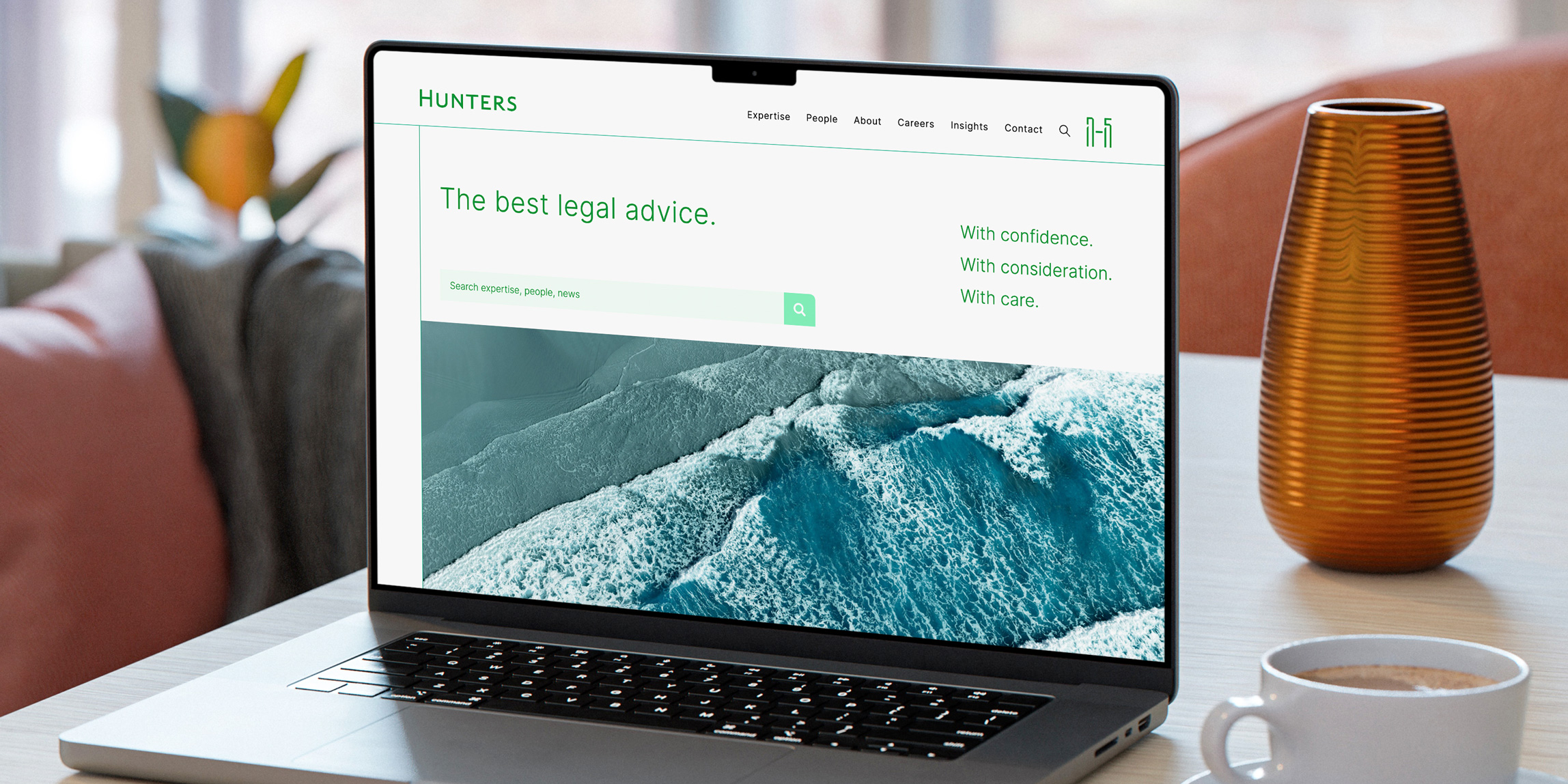
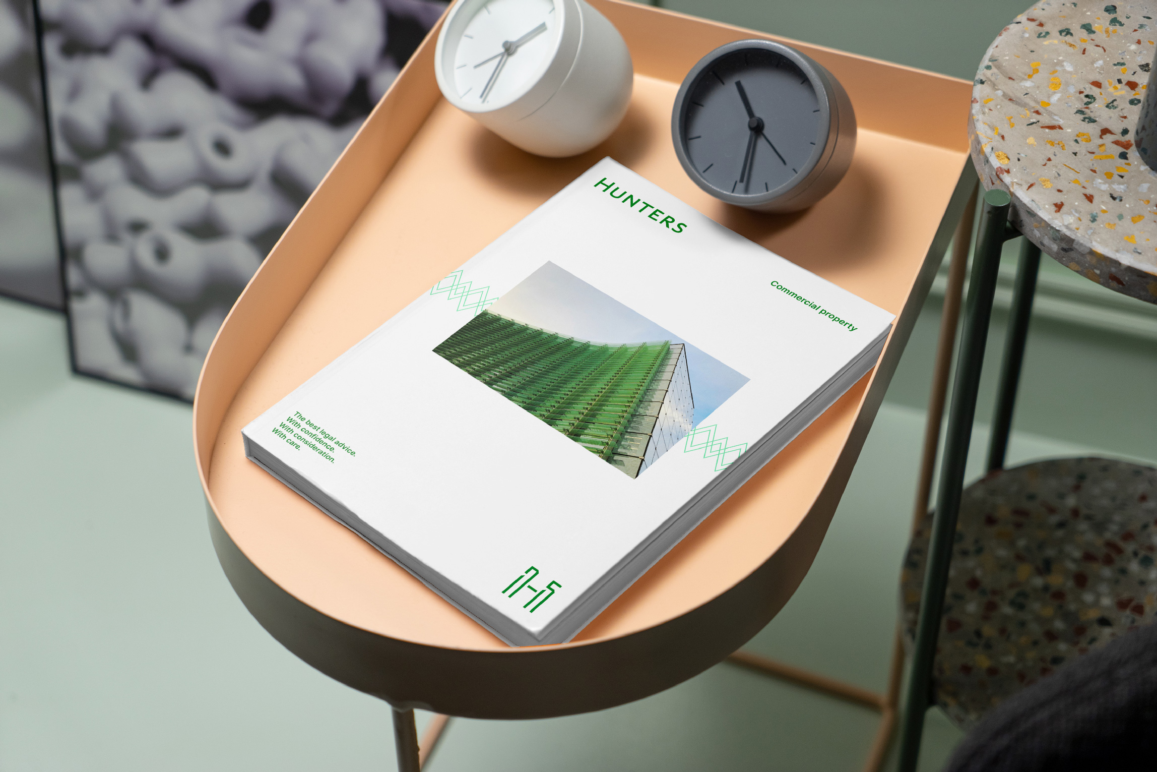
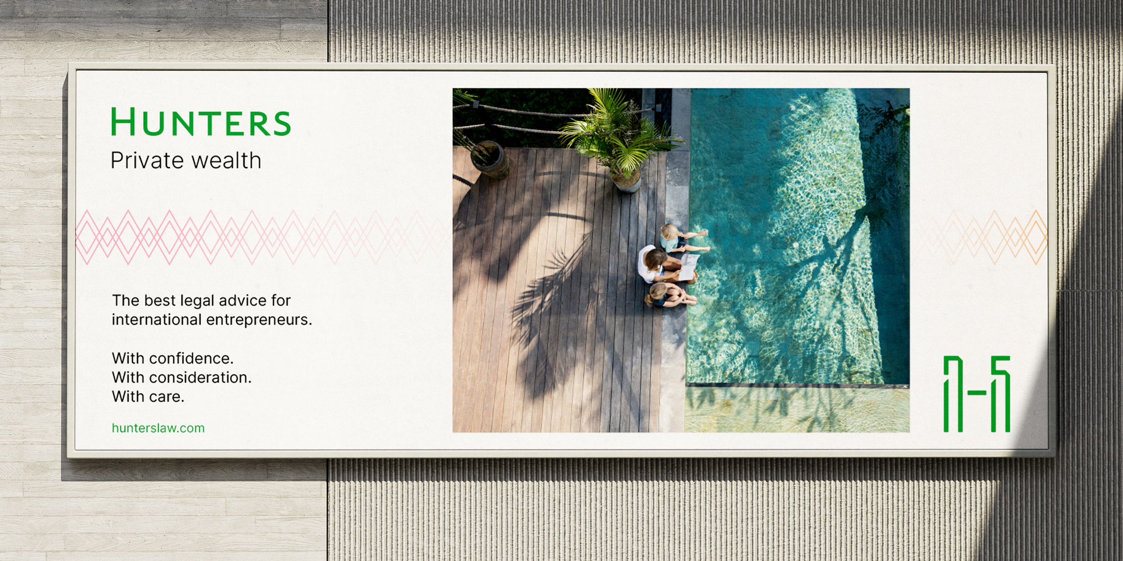
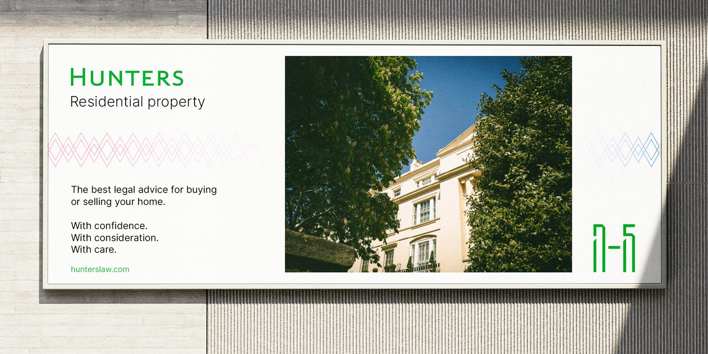
Their story is summed up by how they work with their clients: ‘With confidence, with consideration, with care.’ We made these the design principles for the identity and website – all designed with elegance and serenity.
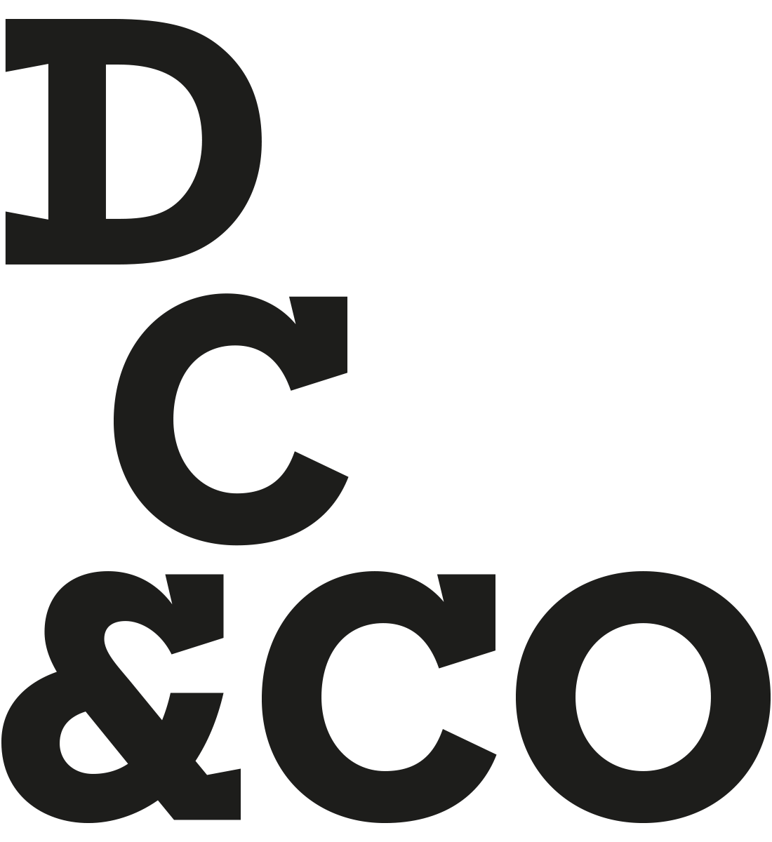
For a firm with such a long history there wasn’t any old identities or visual clues in their archives. So we’ve created a new tradition with the H 1715 symbol. Designed to be timeless, the symbol is an interplay between a capital H and 1715.
We’ve restored the Hunters Green and given it a fresh modern flavour.
The rebrand and website has been extremely well received by clients and by employees. And one rival law firm has described it as ‘design to die on the hill for’.
![]()
The Hunters logotype is a modern interpretation of the classic serif font Caslon. Caslon was first published in the early 1700s and the logotype is based on its proportions and characteristics.
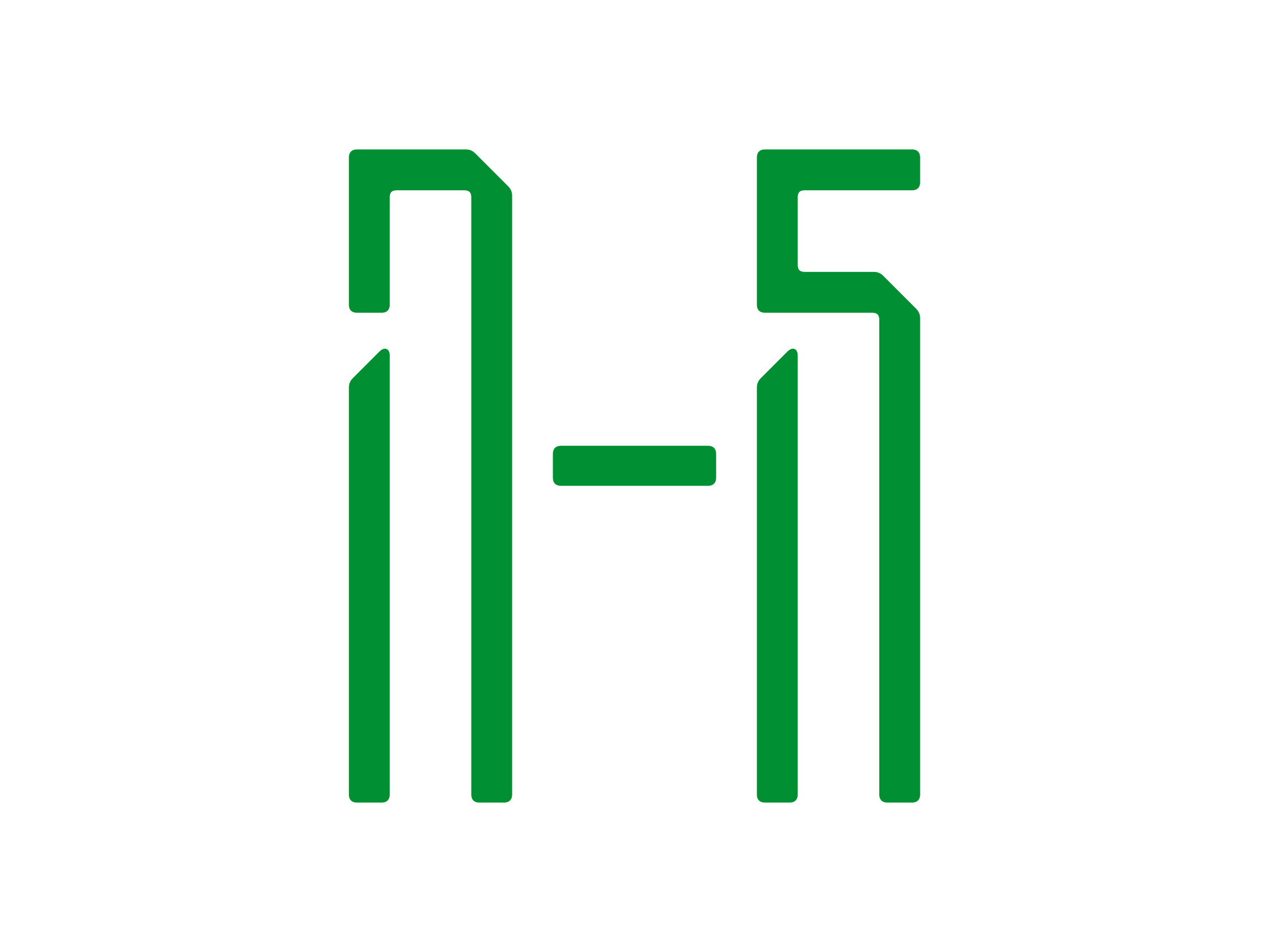
The Hunters H 1715 symbol is an interplay between a capital H and 1715, the year Hunters started. Some people will see the H first and some people see 1715. And some see both, which is fine.
The wayfinding icons are based on the H 1715 symbol design.
![]()
How's your brand?
Feel free to get in touch for an initial conversation about creating the fresh start for your brand.