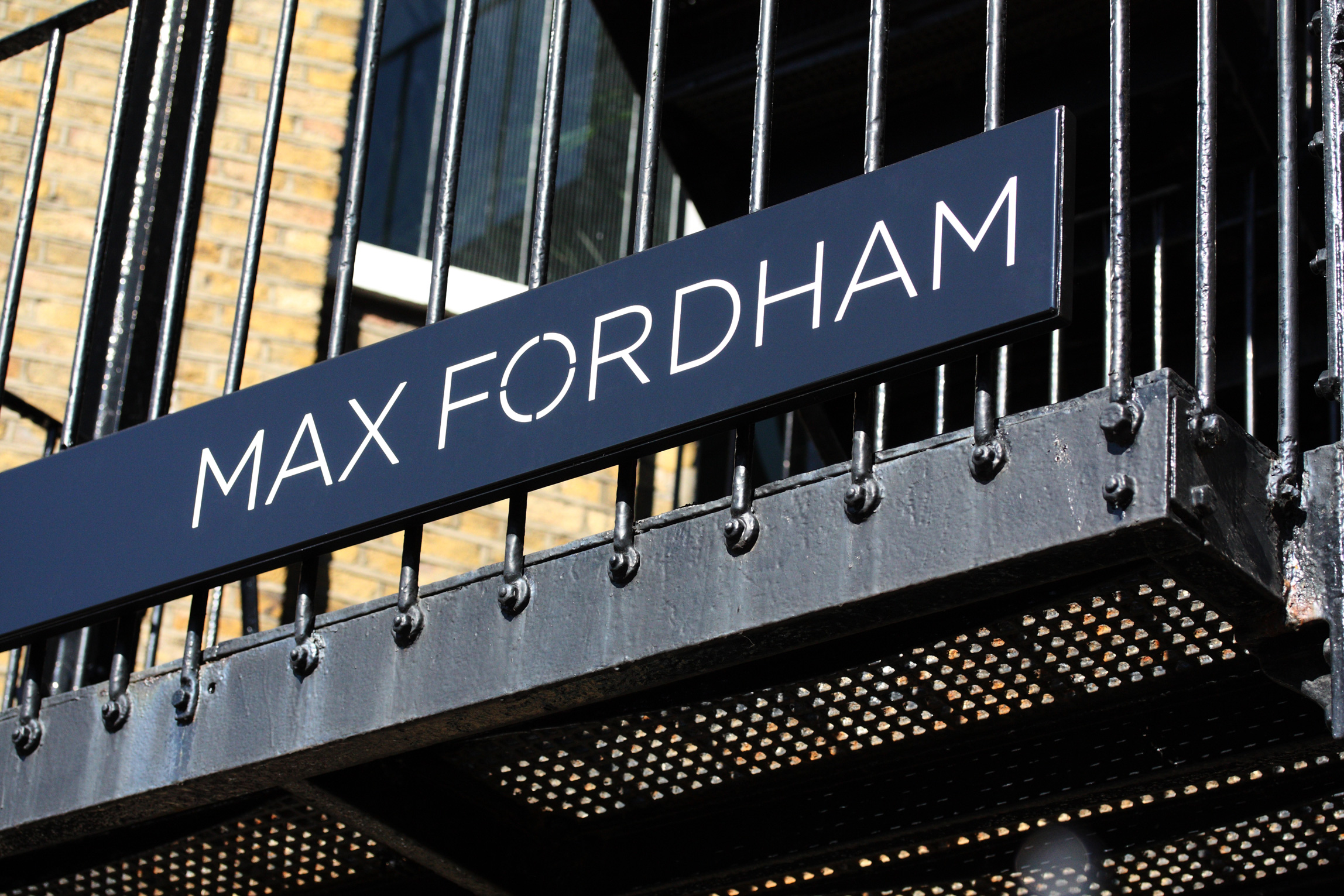
Max Fordham

Profits +28% / New projects +60%

Sustainability. Beautiful. Engineering.

The new brand and identity is already proving its worth and achieving the objectives we set for it: it’s reinvigorated people’s feelings about what is different and special about Max Fordham; it’s re-established the credentials of the practice as leaders in their field; it’s helped to give us visibility and presence with our audiences. That all creates the atmosphere for developing the practice and winning business.

Gemma Blencowe

Head of Brand and Communications 2008–2011, Max Fordham

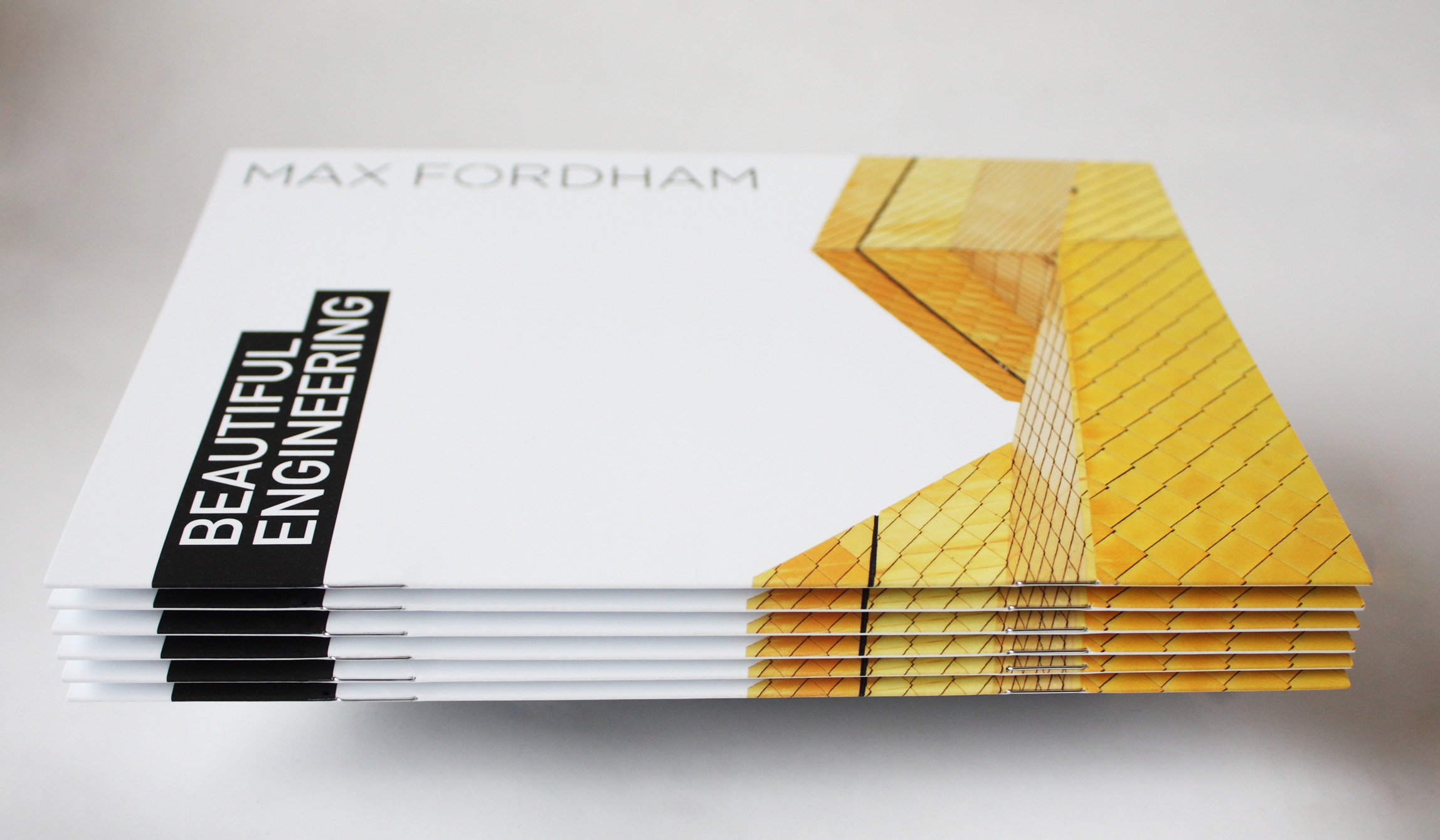
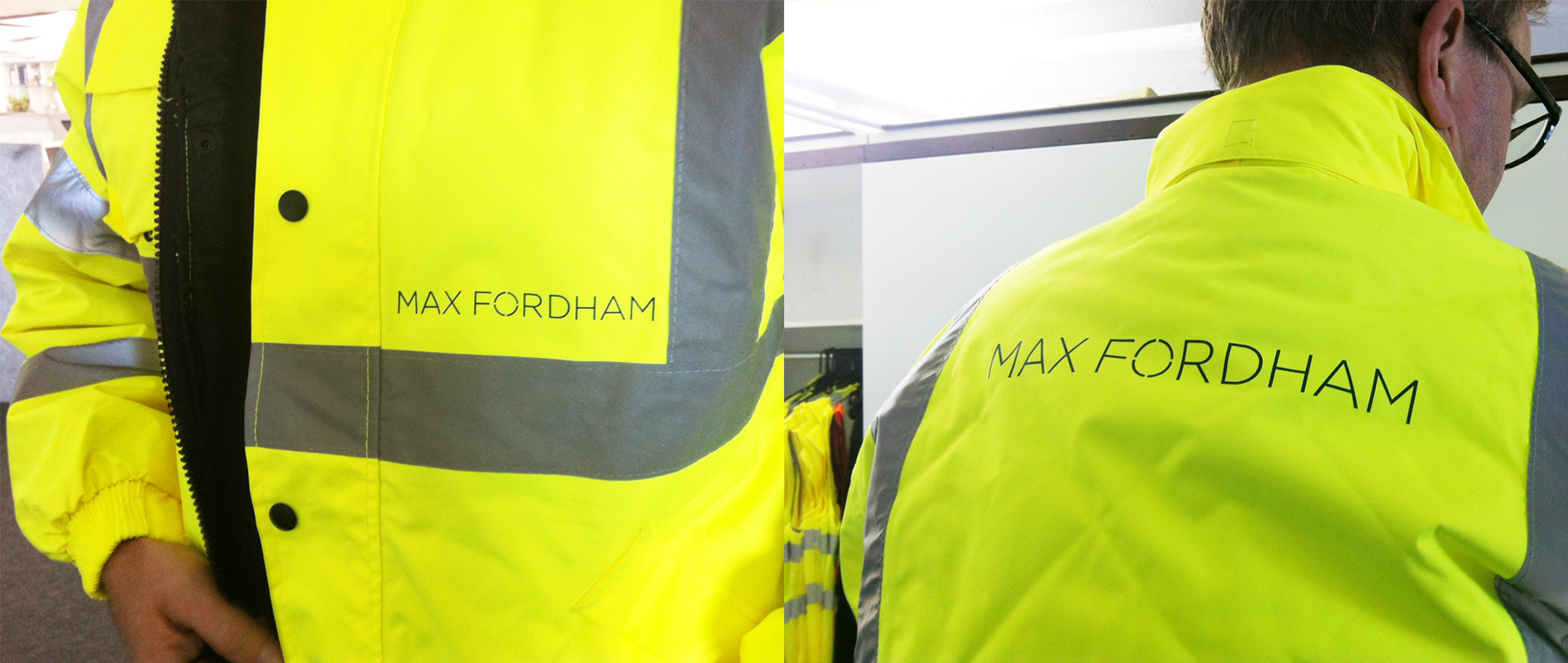
Max Fordham pioneered environmental engineering in the sixties. Founded in 1966 in the spare room of Max Fordham’s house in Camden, the practice grew to 130 people by 2009, working with leading architects on buildings across continents. Max was a genuine pioneer in sustainable design, decades before it became mainstream.

Then recession hit. Key independent competitors were absorbed by multinationals. Max Fordham faced being marginalised. The client base eroded, staff left, morale sank. Following Max’s retirement, the new leadership team knew the brand needed to match the quality of their engineering.

Our ambition was to reconnect the firm’s people with their founder’s passion for innovation and excellence. 
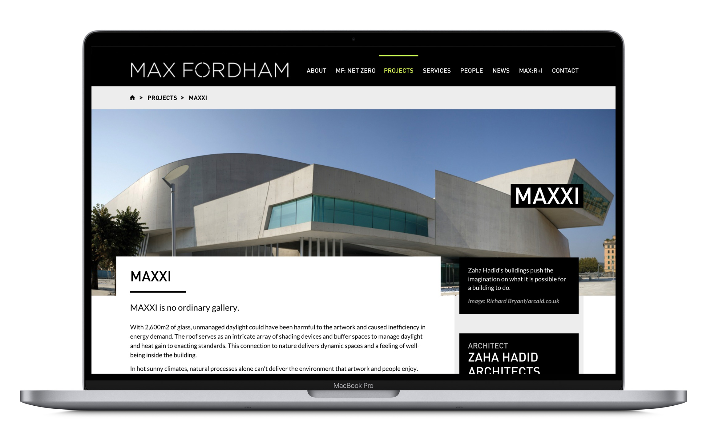
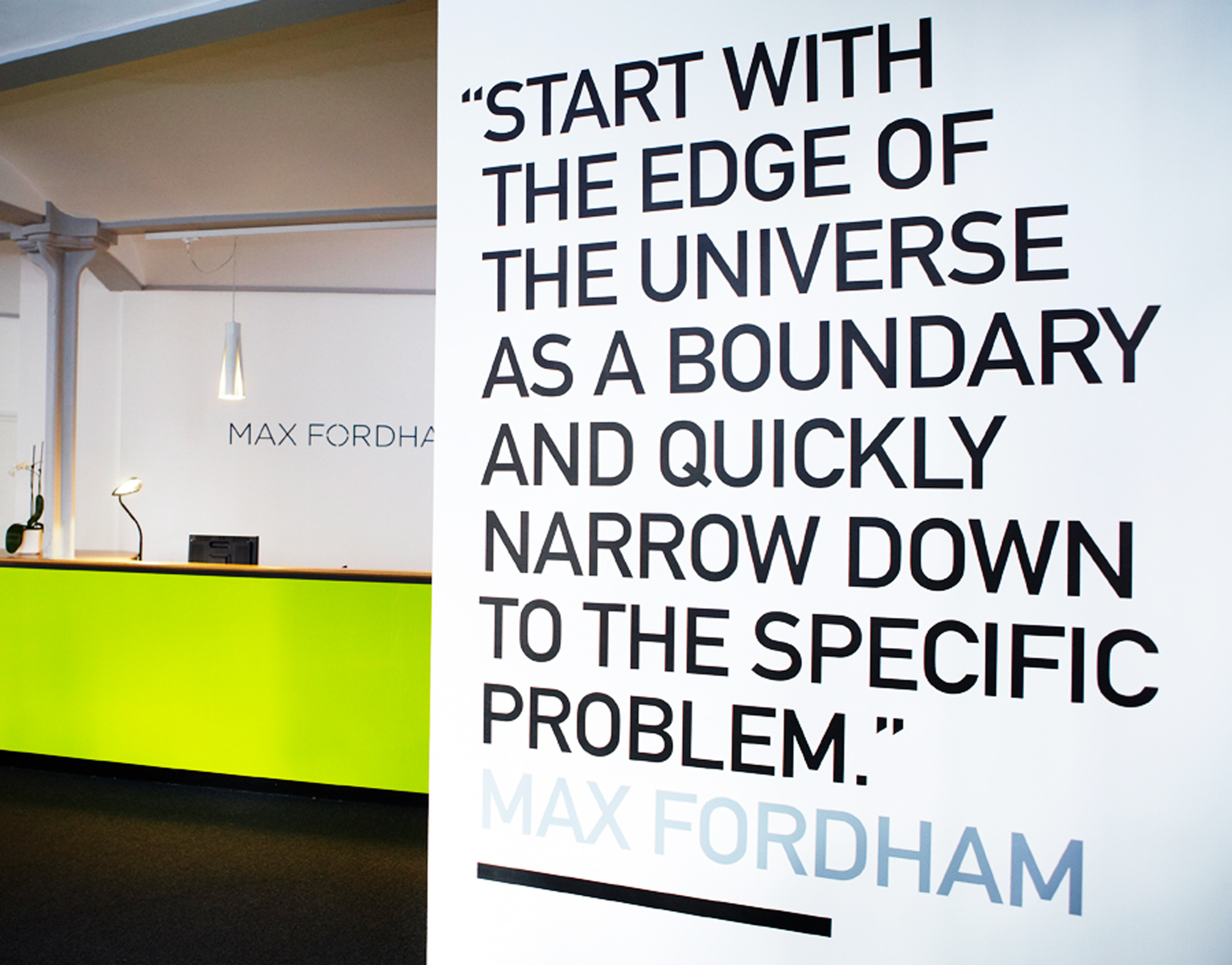
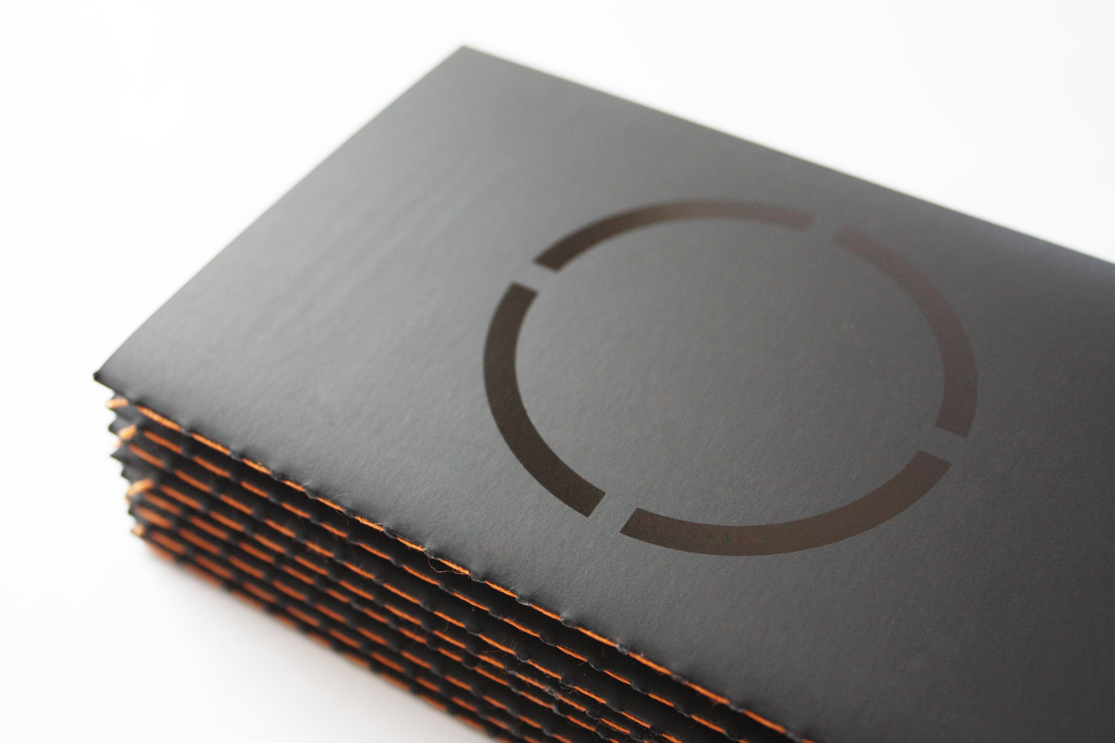
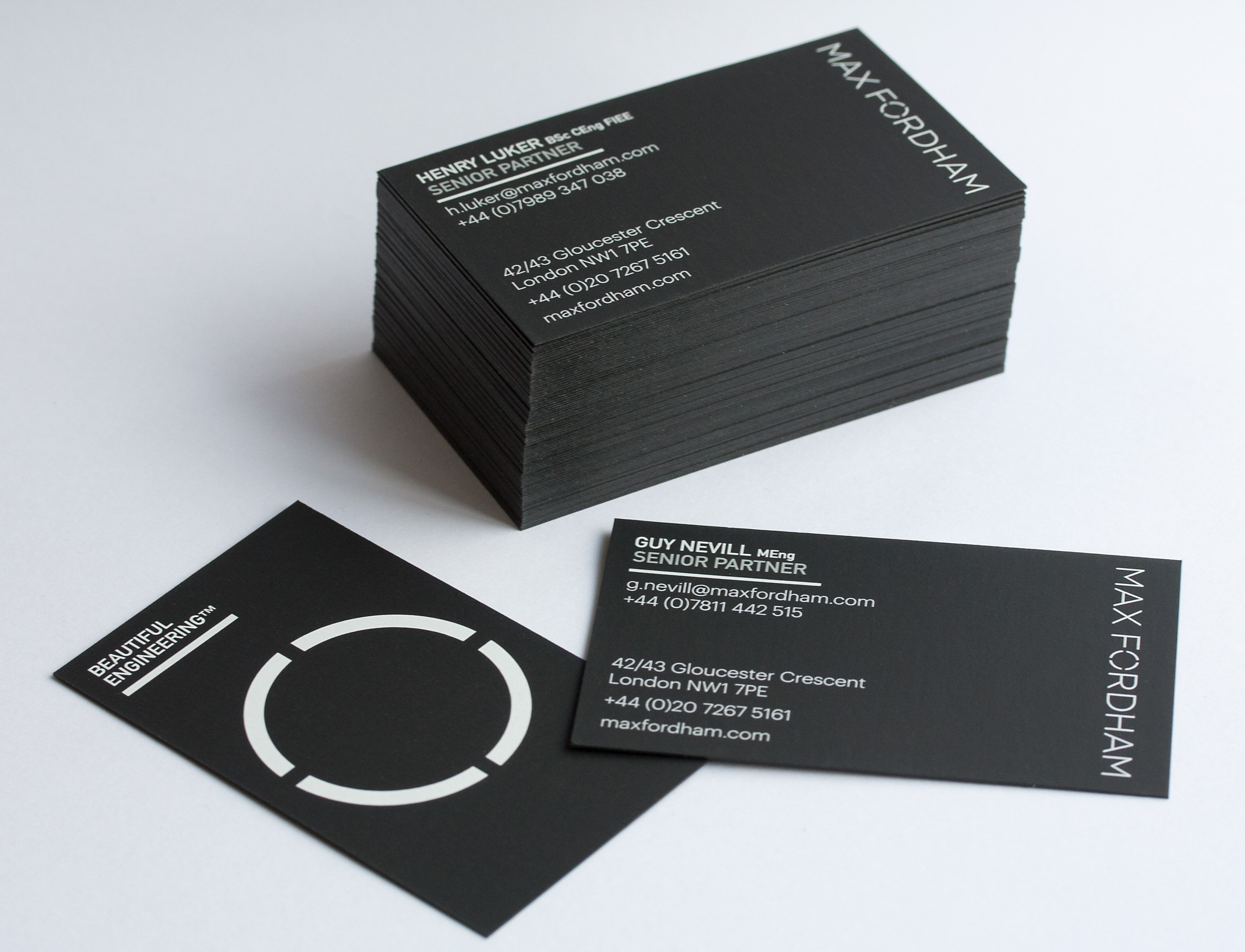
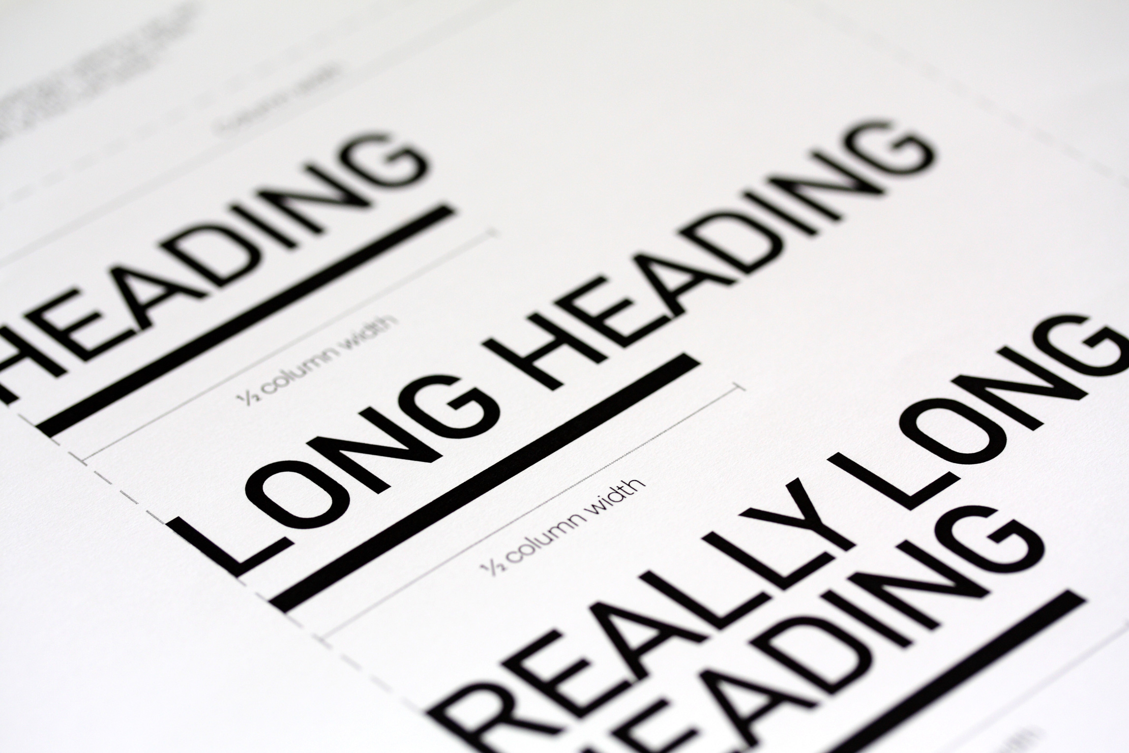
We established ‘Beautiful Engineering’ as the positioning: accurate, distinctive, and confident enough to justify premium pricing. The new logo separates the company’s name to give it stature and elegance. The circular marque references the original symbol used by the founder in the 1960s. Strong monochromatic graphic design frames Julian Anderson’s abstracted portraits of understated engineering — elevating Max Fordham’s work to the art of crafting light, air, sound and space.

Tate Modern insisted that Herzog and de Meuron work with Max Fordham rather than their preferred partner. “The rebrand has been pivotal to our success.” Christopher Moore, Head of Communications

Transform Awards Gold / Best Creative Strategy. Silver / Best Rebrand from the Professional Services Sector. Silver / Best Implementation.


The Max Fordham wordmark logo in white on a black background, final version showing the custom letterforms with distinctive crossbar, Max Fordham building engineering rebrand, by David Carroll & Co London

MacBook Pro mockup showing the Max Fordham website's MAXXI case study page, featuring a full-bleed exterior photograph of the Zaha Hadid-designed MAXXI museum and project description text, Max Fordham building engineering rebrand, by David Carroll & Co London

A Max Fordham branded signage showing the office reception with a lime green desk on the left, alongside a large typographic inspirational quote reading Start with the edge of the universe as a boundary and quickly narrow down to the specific problem, Max Fordham building engineering rebrand, by David Carroll & Co London

A grid of close-up architectural material photographs alongside a large monochrome image of a corrugated metal building facade with lighting rigs, from the Max Fordham MAXXI case study brochure, photography by Julian Anderson, Max Fordham building engineering rebrand, by David Carroll & Co London

A stack of Max Fordham Beautiful Engineering marketing brochures fanned out, with a white cover bearing the brand name and black spine with the Beautiful Engineering strapline, alongside a yellow textured geometric model, Max Fordham building engineering rebrand, by David Carroll & Co London


Three Max Fordham Beautiful Engineering case study brochure covers showing the MAXXI Rome 2010, St Martin-in-the-Fields London 2009, and Heelis Swindon 2006 projects, Max Fordham building engineering rebrand, by David Carroll & Co London


Close-up of the Max Fordham MAXXI case study brochure cover with large white typeset text reading MAXXI, Museo Nazionale delle Arti del XXI Secolo, Rome 2010 on a black background, Max Fordham building engineering rebrand, by David Carroll & Co London

Close-up of an open Max Fordham MAXXI brochure page showing bilingual Italian and English text under the heading IL CLIENTE / THE CLIENT describing the museum brief, Max Fordham building engineering rebrand, by David Carroll & Co London

Close-up detail of the Max Fordham MAXXI case study brochure open spread, focusing on the right-hand page with a dramatic interior staircase photograph and solitary figure, Max Fordham building engineering rebrand, by David Carroll & Co London

The Max Fordham brand book with a dark grey embossed cover featuring the circular motif, with orange-gold gilded page edges visible, Max Fordham building engineering rebrand, by David Carroll & Co London

An open spread of the Max Fordham Beautiful Engineering brochure showing the dark charcoal front cover alongside the opening text page headed Beautiful Engineering, Max Fordham building engineering rebrand, by David Carroll & Co London

An open spread of the Max Fordham Beautiful Engineering brochure with a grid of architectural photography on the left and a text page headed Buildings Brought to Life on the right, Max Fordham building engineering rebrand, by David Carroll & Co London

Close-up of the Max Fordham Beautiful Engineering brand book cover in dark charcoal cloth with foil-stamped title in white, Max Fordham building engineering rebrand, by David Carroll & Co London

Max Fordham business cards in black with the wordmark and Beautiful Engineering strapline, showing a stack and two individual cards with Senior Partner contact details including the circular motif, Max Fordham building engineering rebrand, by David Carroll & Co London

The Max Fordham external building signage — a dark metal panel with the wordmark in white lettering mounted on a brick building facade with iron railings, Max Fordham building engineering rebrand, by David Carroll & Co London

A split image showing the Max Fordham office interior with a lime green door on the left, and a close-up of the branded internal signage showing floor number 42 with a circular motif and gender-neutral toilet pictograms on the right, Max Fordham building engineering rebrand, by David Carroll & Co London

Two engineers wearing hi-vis yellow jackets branded with the Max Fordham wordmark on the back, photographed from behind on a construction site, Max Fordham building engineering rebrand, by David Carroll & Co London

A close-up of the Max Fordham brand guidelines document showing typographic heading hierarchy demonstrations — Heading, Long Heading, and Really Long Heading — in bold black type with rule lines, Max Fordham building engineering rebrand, by David Carroll & Co London

Portrait photograph of Max Fordham speaking at a microphone on stage, lit in dramatic purple and blue lighting, wearing a light suit and bow tie, Max Fordham building engineering rebrand, by David Carroll & Co London


Revenue +15%   Profits +28%   New projects +60%   Employees +43%

“Every designer is looking for ‘it’ and that when you find ‘it’ you know it and difficulties melt away because ‘it’ works. You have definitely found ‘it’ for Max Fordham.”
Gemma Blencowe, Head of Brand and Communications, Max Fordham

“The new identity has reinvigorated us as individuals and really focused us on our competitive advantage. Working with David Carroll and Co is already paying off and is proving to be an effective business development investment.”
Henry Luker, Senior Partner, Max Fordham
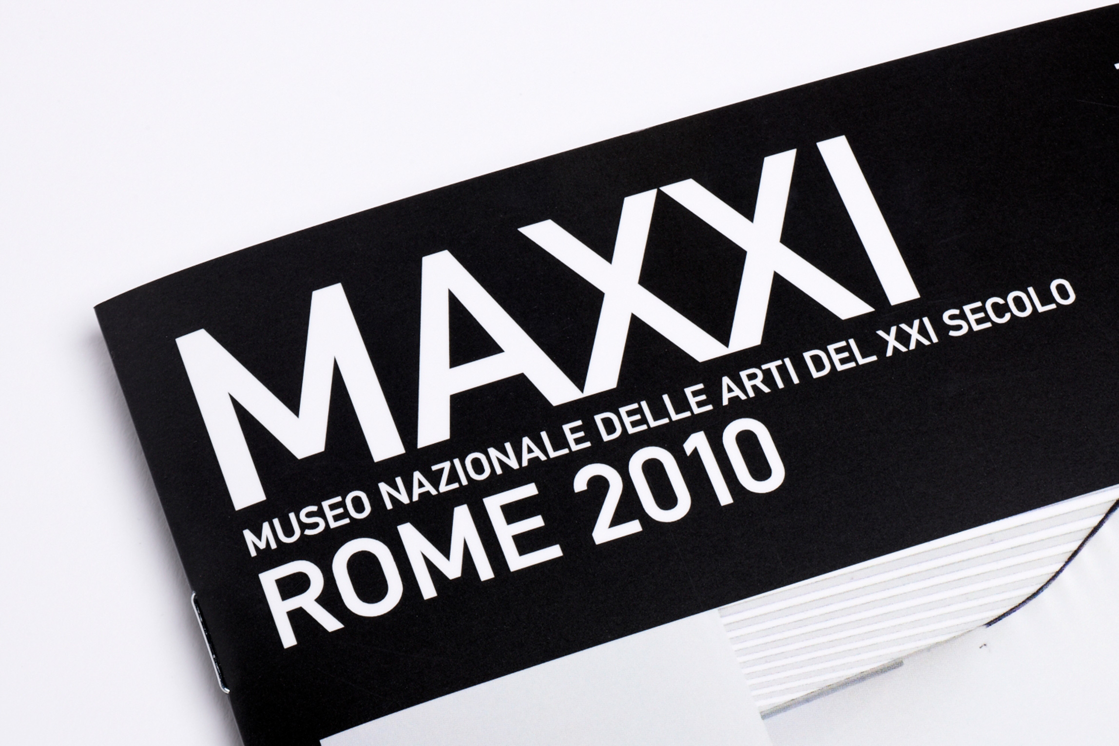
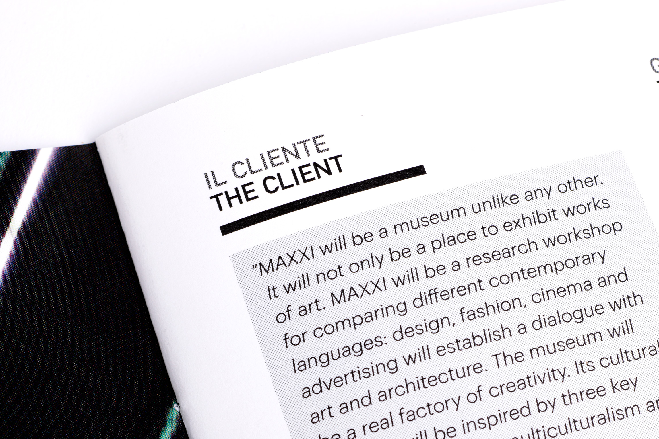
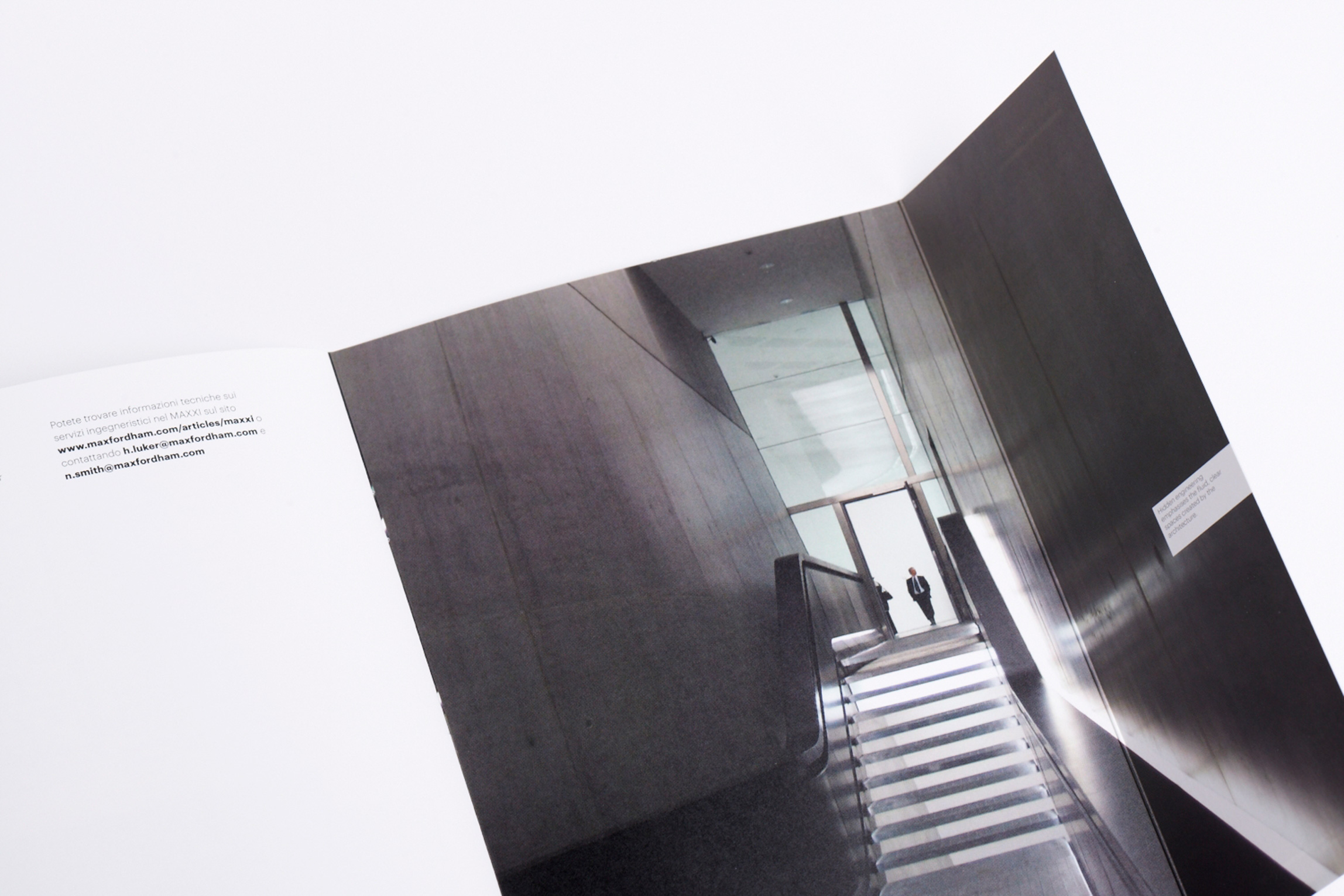
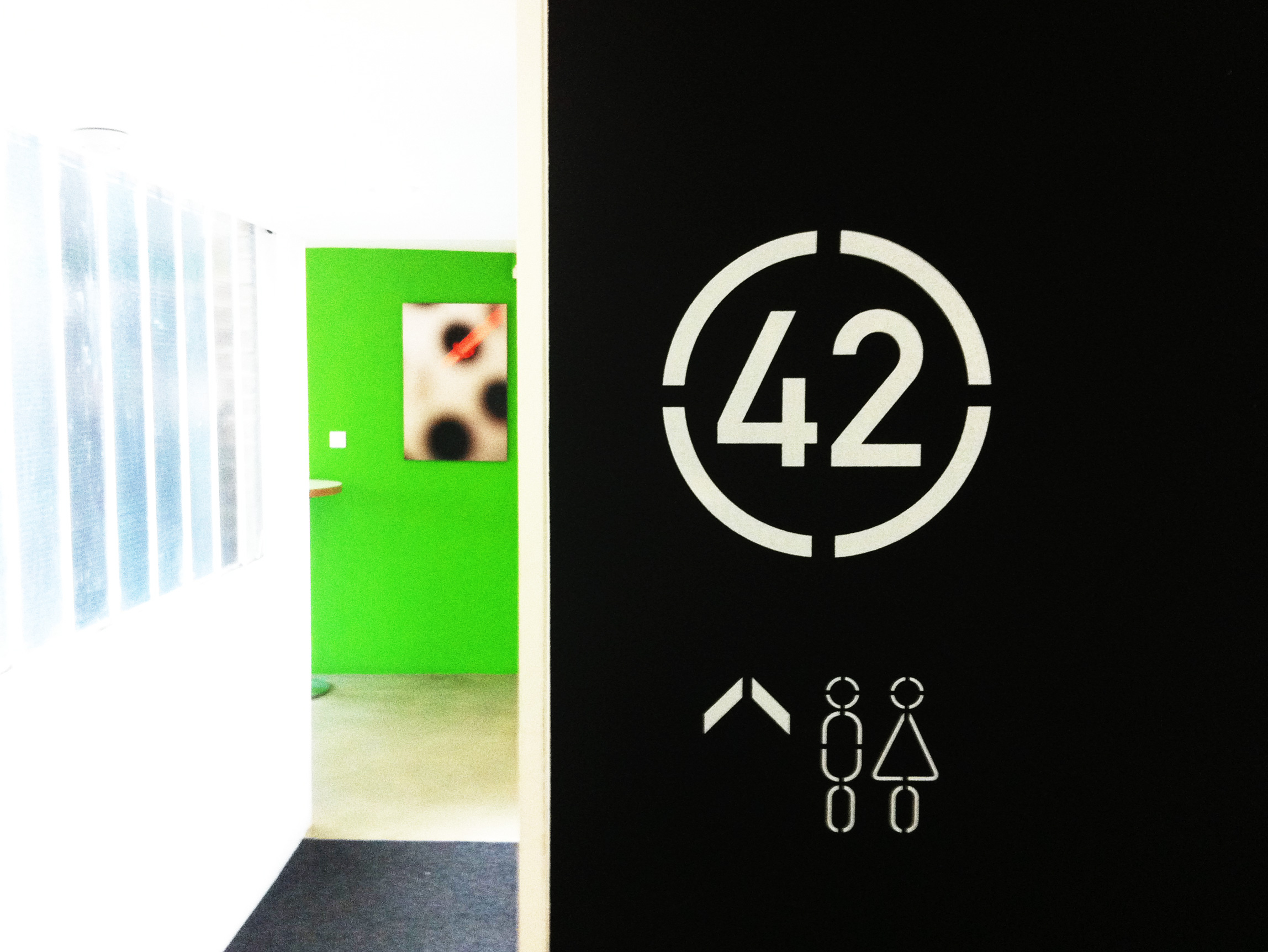
What we did

We led the full rebrand: audit, research, stakeholder interviews, brand strategy, positioning and identity, built around a single idea: Beautiful Engineering. A positioning that was both accurate and genuinely distinctive, and gave Max Fordham the confidence to own their place in the market. The work covers logo, stationery, website, project brochures, practice booklets, Word templates, PowerPoint, brand guidelines, email newsletters, advertising, building site hoardings, environments and signage.

How's your brand?

No pitch. No obligation. Just an honest conversation about your brand.